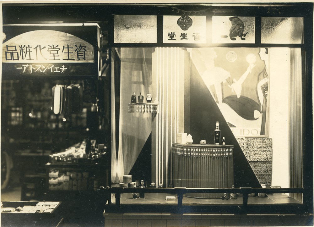
Welcome to this installment of our ongoing magazine feature, "SHISEIDO MUSEUM." In each edition, we explore the evolving landscape of Shiseido's product packaging and advertising, each rich with its own unique tale of "beauty." Through these curated stories, we aspire to deepen your appreciation for Shiseido's enduring messages of hope and beauty for the future.
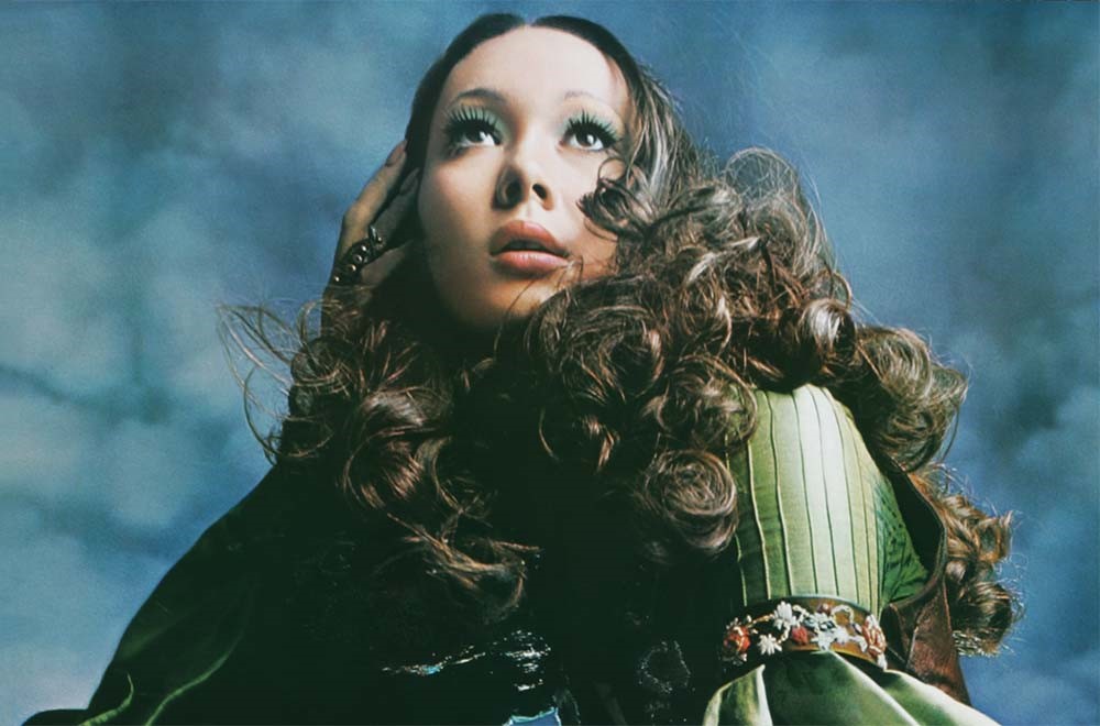
Art Director: Makoto Nakamura
Designer: Jousuke Kubo, Nobukuni Takada
Photographer: Noriaki Yokosuka
Model: Tina Chow
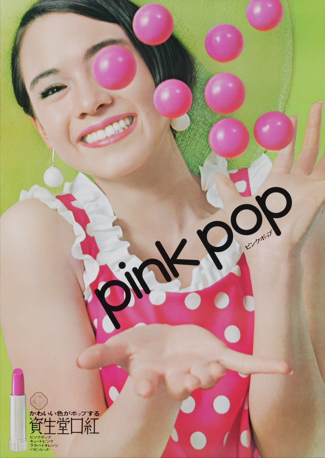
Shiseido's "Pink Pop" Lipstick: Cute Colors Popping Off
Spring of 1968 introduced Shiseido's “Pink Pop,” an ebullient campaign anchored by a vivid poster featuring a captivating pink ball, an effervescent model in a chic ensemble, and her radiant smile. This iconic visual was designed not just to catch the eye, but also to lift the spirits of all who encountered it.
In 1961, Shiseido launched its first nationwide campaign, "Candy Tone," marking the beginning of an annual tradition: the unveiling of fresh lipstick shades each spring to mirror that year's color trends. The 1960s, a decade of seismic cultural and lifestyle shifts—exemplified by phenomena like the worldwide rise of the miniskirt—were mirrored in Shiseido's dynamic campaigns.
The "Pink Pop" initiative went beyond merely echoing the fashion and color trends of its time. It offered a new vision for living, capturing the effervescence and optimism that defined the era.
As trends have ebbed and flowed over the years, pink remains a cornerstone color in the world of makeup. It prompts the intriguing possibility that this hue may harbor secrets to our collective well-being, offering subtle clues to a fulfilling life in the present day.